

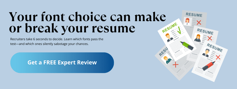
Best & worst fonts for a resume
If you’re wondering what font to use for a resume, you’re not alone. Font choice plays a key role in how your resume is perceived—and whether it gets a second glance. Below are some of the best resume fonts favored by recruiters, along with when (and when not) to use them.
✅ Arial
Arial is often considered the safest bet for resume writing. It’s clean, easy to read, and widely accepted across industries—from business to healthcare to government. Its neutral design doesn’t distract from your content, which is why it remains a favorite among more traditional recruiters. However, because of its ubiquity, it can come across as a bit plain—especially to younger hiring managers looking for more modern design sensibilities. Still, if you’re aiming for maximum clarity and universal compatibility, Arial delivers. For tighter layouts, Arial Narrow offers a space-saving alternative without compromising legibility.
✅ Calibri
If you’re looking for the best resume font that’s clean, professional, and space-efficient, Calibri is an excellent choice. Its popularity stems from being the default font in Microsoft Word, which means it’s instantly recognizable and easy to process for most recruiters. The rounded edges give it a friendly, modern tone, making it especially suitable for roles in tech, startups, and education. One of Calibri’s biggest strengths is its compact letter design—it lets you fit more information on the page without sacrificing readability. If your resume is content-heavy but still needs to breathe, Calibri can help strike that balance beautifully.
✅ Cambria
Cambria offers a polished, traditional look that’s ideal for roles where formality and structure are valued. Its evenly spaced lettering and strong readability make it a reliable choice for resumes and especially effective for cover letters. Cambria handles small font sizes and dense bullet points with ease, so it’s a strong contender if your resume includes a lot of detail. The serif design adds a classic touch that resonates well in academic, legal, and administrative fields. It’s also optimized for on-screen reading, which means your resume will maintain its clarity whether it’s viewed on a laptop or mobile device. If you’re aiming for a professional tone with a hint of authority, Cambria is a safe and sophisticated pick.
✅ Helvetica
Helvetica is a top pick among designers and for good reason. Its clean lines and balanced structure give off a modern, confident vibe without relying on decorative flourishes. Often compared to Times New Roman in terms of professionalism, Helvetica delivers the same authority but with a sleeker, more contemporary feel. It’s used in the branding of companies like Jeep, Lufthansa, and Panasonic, which speaks to its universal appeal and visual clarity. If the company you’re applying to uses Helvetica in its brand materials, using it in your resume can create a subtle but strategic alignment. Helvetica works especially well for corporate roles, resume headers, and industries that value design precision—such as architecture, advertising, and UX. It’s resume minimalism done right.
✅ Georgia
Georgia strikes a balance between classic and fresh. While it carries the formality of a serif font, it avoids the overly familiar look of Times New Roman or the plainness of Arial. Its wide, open characters make it highly readable on screens, which is why it’s often recommended by career centers and universities—especially for new graduates submitting digital resumes. Georgia works well across a variety of industries, particularly those that value clarity, tradition, and accessibility. It’s a great choice when you want your resume to feel polished without looking outdated.
✅ Garamond
If you’re aiming for a resume that feels refined without being rigid, Garamond is an excellent choice. It brings a touch of artistic flair while staying fully professional. With its elegant strokes and graceful proportions, Garamond is especially popular among creatives—writers, designers, performers, and others in the arts. It reads smoothly and has a timeless sophistication that can help you stand out without being loud. If your goal is to signal taste, attention to detail, and creative depth, Garamond checks all the right boxes.
Top 4 fonts to avoid on a resume (& why)
Not all fonts are created equal. Some carry reputations, readability issues, or design baggage that can undermine even the strongest qualifications. Here are four fonts you should never use on a resume—and exactly why.
❌ Comic Sans
Comic Sans is widely seen as unprofessional, informal, and—even worse—childish. Originally designed for casual documents, it’s most commonly found in birthday invites, comic strips, or school handouts. Using it on a resume sends the wrong message and clashes with the seriousness of your application. Even in creative fields, it lacks the subtlety and refinement required to be taken seriously. If you’re aiming for creativity, there are far better options that maintain professional tone.
❌ Papyrus
Papyrus might feel artistic at first glance, but it’s heavily stigmatized in design circles for being outdated and overused. Its irregular strokes and ornamental design distract from your content and give your resume an amateur look. The font is so stylistically heavy that it overwhelms rather than supports the information you’re presenting. Recruiters often associate it with poor design judgment—and that’s not the impression you want to leave.
❌ Courier New
Courier New mimics the look of an old-school typewriter, but its monospaced format results in excessive white space and awkward alignment. This makes your resume harder to scan quickly—something you can’t afford when hiring managers spend mere seconds reviewing each application. While you might be tempted to use it for tech or coding roles, there are modern monospaced alternatives (like IBM Plex Mono) that achieve the same aesthetic without compromising polish.
❌ Times New Roman
Once the default for everything, Times New Roman now comes across as stale and uninspired. It doesn’t actively hurt your resume, but it certainly doesn’t help it stand out either. Its widespread use has dulled its impact, making your application feel generic. The exception? Academic CVs, where tradition still reigns. For everyone else, fonts like Georgia or Cambria offer the same formal feel—without looking like a template from 1998.
How to make the font ATS-friendly
An impressive resume is useless if it never reaches human eyes. Applicant Tracking Systems (ATS) are the first gatekeepers in many hiring processes, and your font choices can affect how well your resume is parsed. Here’s how to ensure your font is ATS-approved:
Start with a standard, widely supported typeface. Fonts like Arial, Calibri, Georgia, Garamond, and Helvetica are safe bets—they’re clean, professional, and universally readable. While Times New Roman is technically ATS-friendly, it’s often seen as dated and may work against you when your resume is viewed by a human.
To further boost ATS compatibility:
- Use a font size between 10–12 points for body text. Headers can be slightly larger, but avoid oversized fonts that may distort formatting.
- Bold and caps are fine—but use them sparingly. Bolded section titles and job titles are helpful, but overusing ALL CAPS can confuse the ATS and come off as robotic to recruiters.
- Save your resume as a Word document (.doc/.docx) or a simple PDF. These are the safest formats for ATS parsing. Avoid image-based PDFs or export formats that may scramble your text.
- Skip fancy templates with columns or graphics. Multi-column designs may look nice but can break down in ATS systems. Stick to a clean, single-column layout to ensure your content is read correctly.
Final Thoughts
The font you choose for your resume isn’t just a design choice—it’s a strategic one. The best resume font boosts readability, passes through Applicant Tracking Systems, and helps your resume stand out in a recruiter’s inbox for all the right reasons. Whether you’re applying for a role in tech, law, education, or the arts, a clean and professional font sets the tone for how your experience is received.
At CareerTuners, we obsess over these details—so you don’t have to. From font choice to formatting to high-impact content, our resume professional writers make sure your resume looks as strong as it reads. If you’re feeling unsure, we’re here to help.
👉 Need expert eyes on your resume? Schedule a free 15-minute consultation and let’s make your application shine—inside and out.